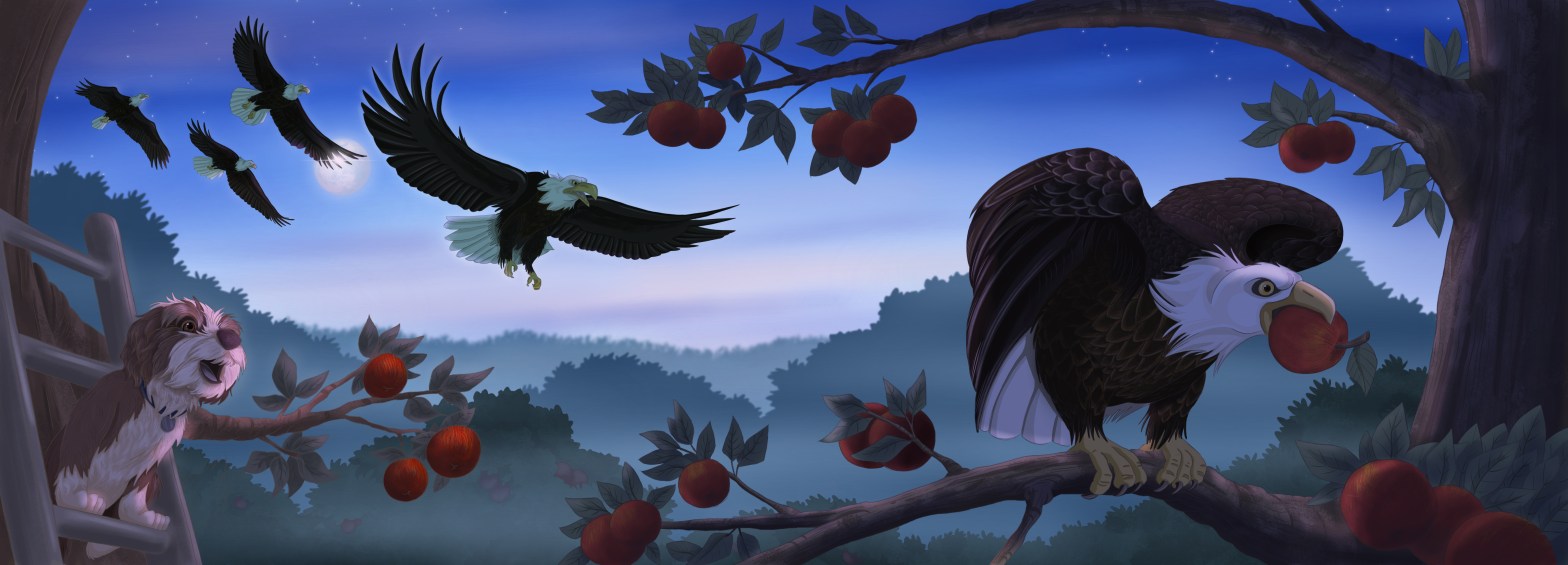
I have learned the hard way that colour displayed on your screen is very different from the final print product. Paper doesn’t have the light that shines through devices and therefore artwork often appears much darker once printed. Since about 30% of The Great Apple Caper takes place at night, I figured it would be good to do a colour check before I get too far ahead.
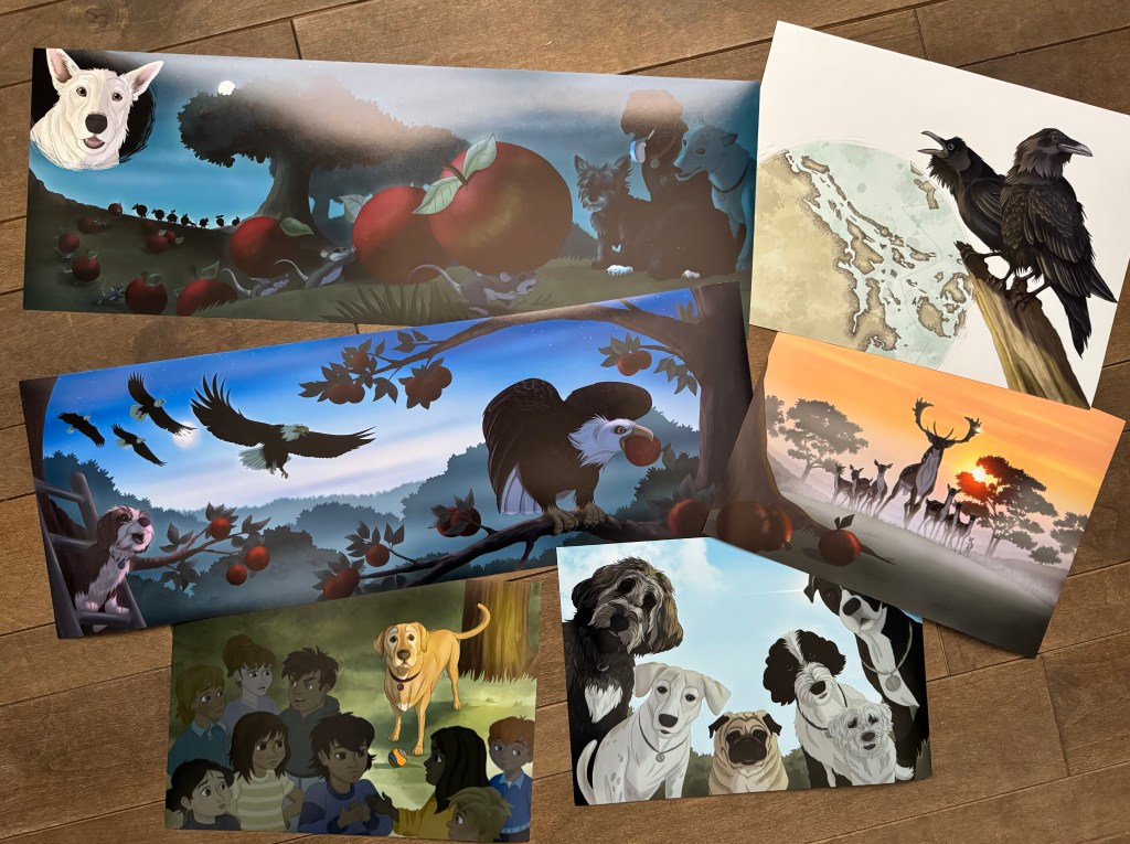
I selected a few of my finished illustrations and sent them over to a professional printer I often work with. Overall I am satisfied with the results. The day scenes look great with lighting and shadow effects coming out the way I wanted. A few of the very dark night scenes needed a slight adjustment but turned out much better than expected.
This is getting very exciting….
